Portfolio
Eight years of design leadership experience at a digital agency has allowed me to work with dozens of diverse organizations across industries and project types.
In these selected projects, I participated both an individual contributor and design leader.

Microsoft Research
How can we thousands of researchers be migrated onto a content management system away from their current system of uploading custom, ad-hoc web pages?
After reviewing all the different types of content being created by researchers, I designed a CMS architecture that could scale to over 4,000 researchers and over 40,000 publications, groups, and projects. Four years after launch, we continue to evolve the platform by moving toward a block-based editor, adding robust faceted search capabilities, and solidifying the design system.
View design artifacts
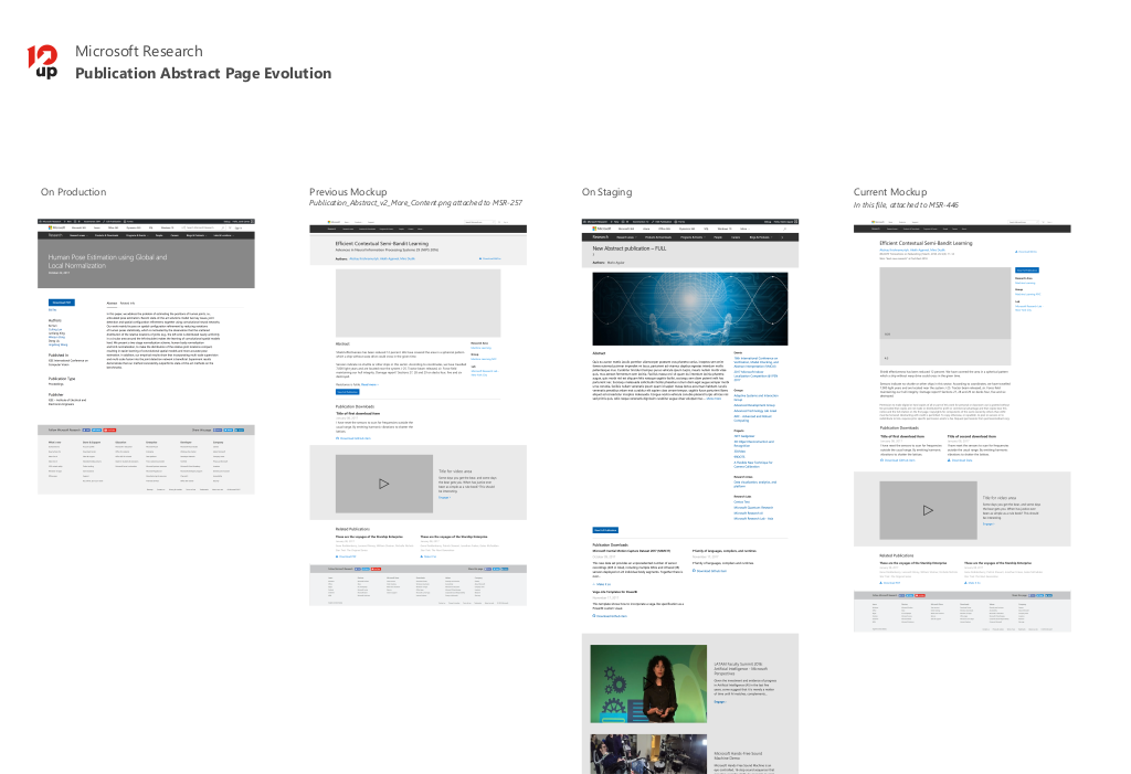
Artifact showing the evolution—both realized and conceptualized—of a publication page 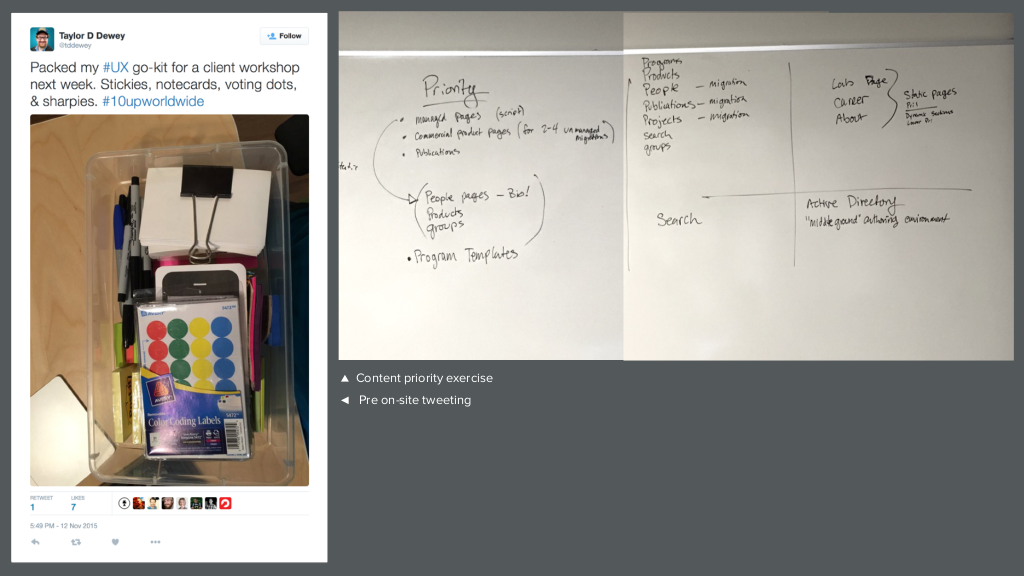
On-site discovery artifacts 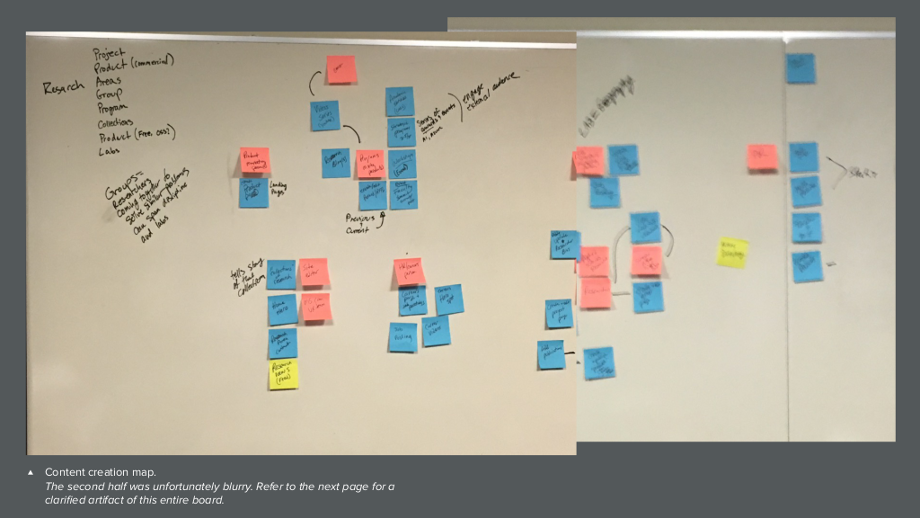
On-site content creation workshop 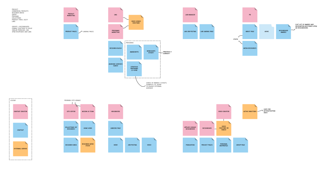
Digitized workshop results. 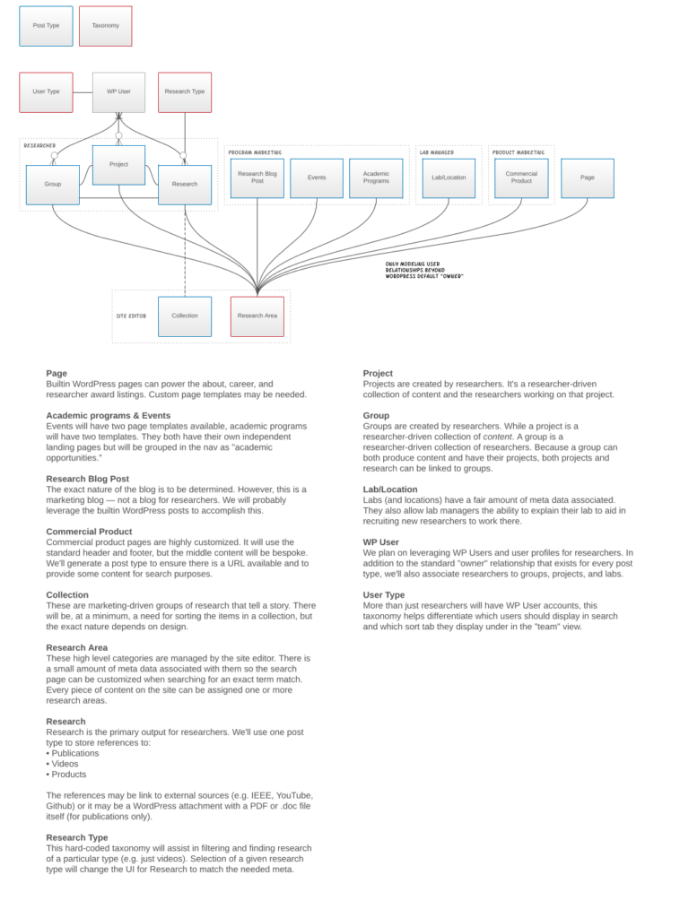
Foundational Architecture Diagram 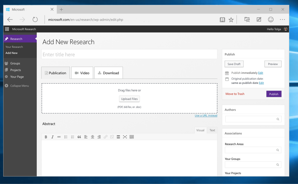
Add research item admin interface mockup
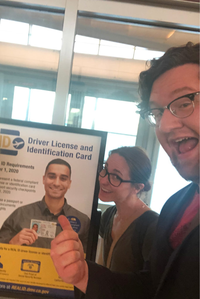
California DMV
How can we shape demand for REAL ID drivers’ licenses so Californians who need a REAL ID from the DMV can get one before the due date?
After an onsite discovery I separated this project into two distinct phases. First was a REAL ID microsite with a short timeline to assist in already-started marketing efforts. Starting soon after, we’d begin work on new user flows, architecture, design, and content for the main DMV website.
View design artifacts
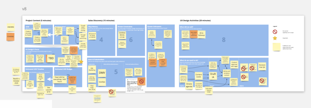
Remote, Internal, UX Design kickoff workshop using a kickoff “canvas”-style board I designed for our UX team. 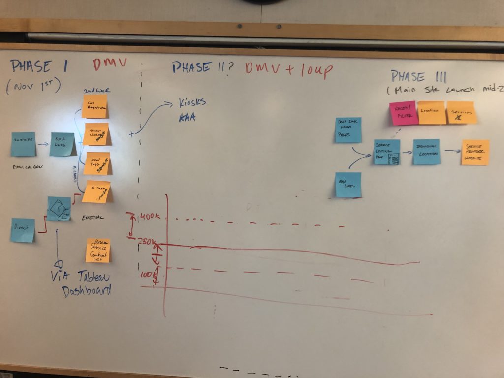
Onsite phase planning for launching a RealID microsite followed by the full DMV website 
Page Description Diagrams help link template goals (from a user flow) to content hierarchy. They serve as a proto-wireframe and can be translated by visual designers into full comps.
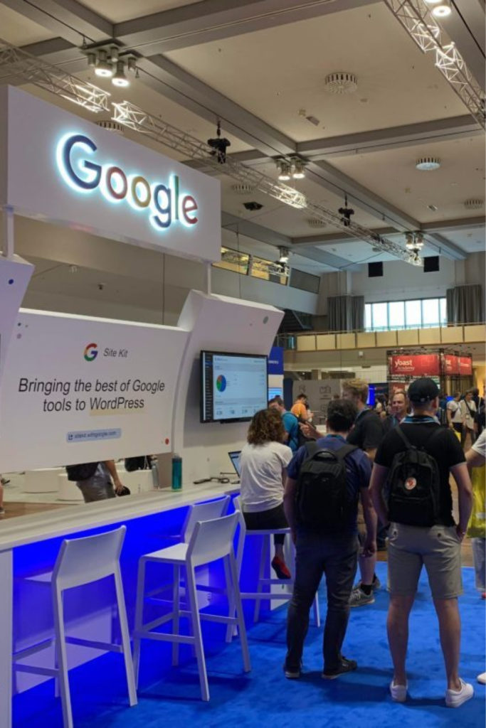
Google Site Kit
How can we seamlessly bring together different Google data services (e.g. Google Analytics) to help site owners continue to grow without needing to leave their CMS or hire an expert.
I completed an early audit and landscape review before taking on a leadership role for multiple designers. We needed to determine:
- What is the best way to manage permissions and access to different Google services?
- What insights or notifications would best motivate site owners?
- How will Google-branded analytics data be presented seamlessly within the WordPress admin?
View design artifacts
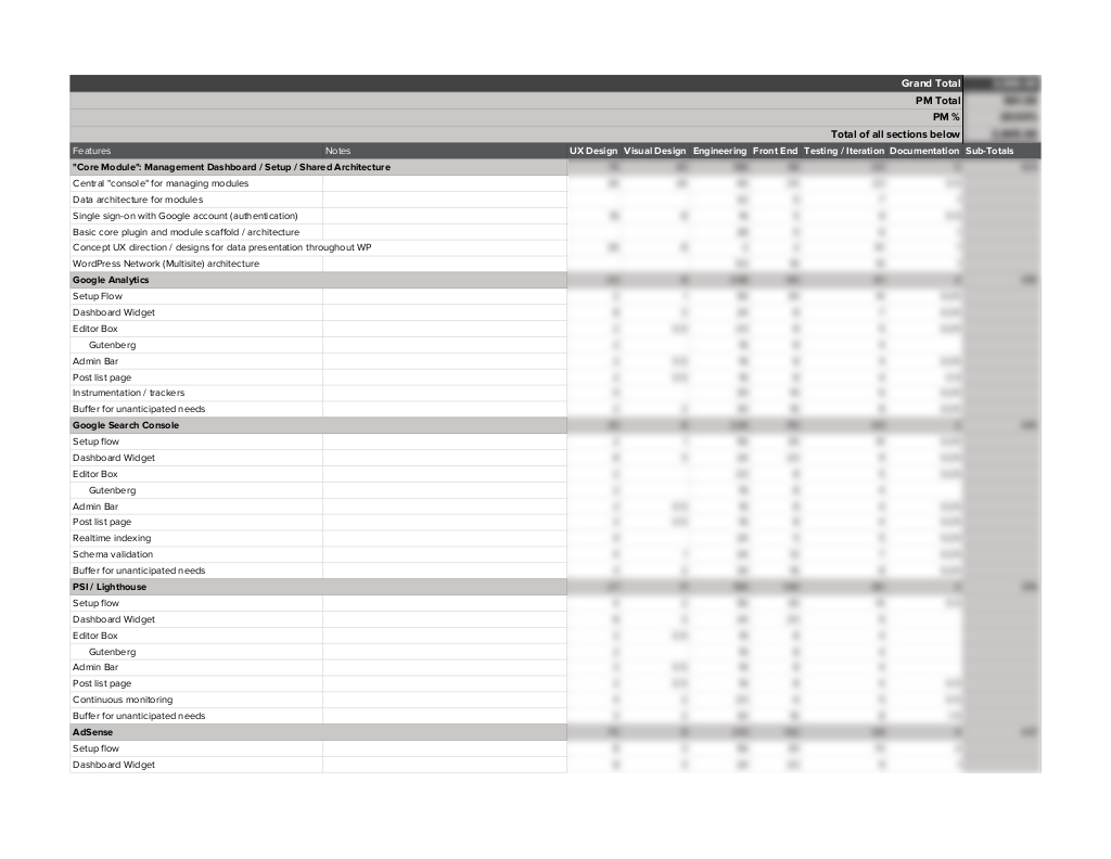
I am involved in scoping and estimating UX Design tasks for many projects at various points during early project phases. 
Early requirements asked for features or modules that could be activated or deactivated. We reviewed plugins with similar interfaces in the ecosystem to determine if there were common patterns we should adopt to increase usability. 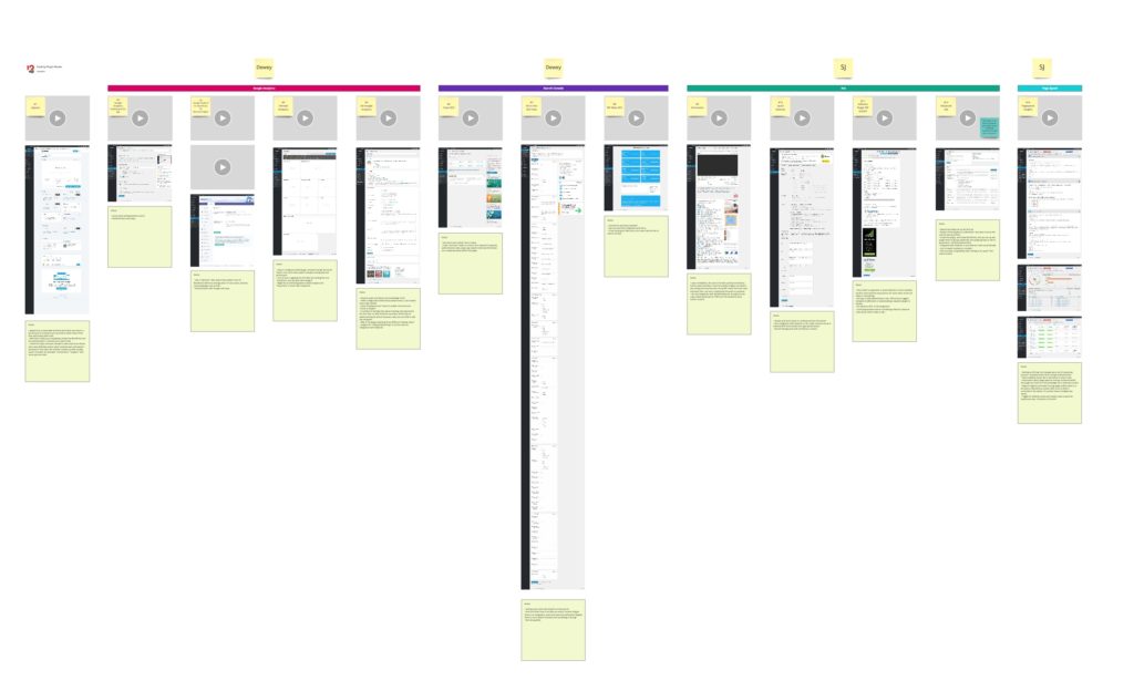
WordPress plugins that shared features of our omnibus plugin were downloaded. The onboarding experience was recorded and screenshots taken for major interfaces. Notes about patterns or common usability issues were taken. 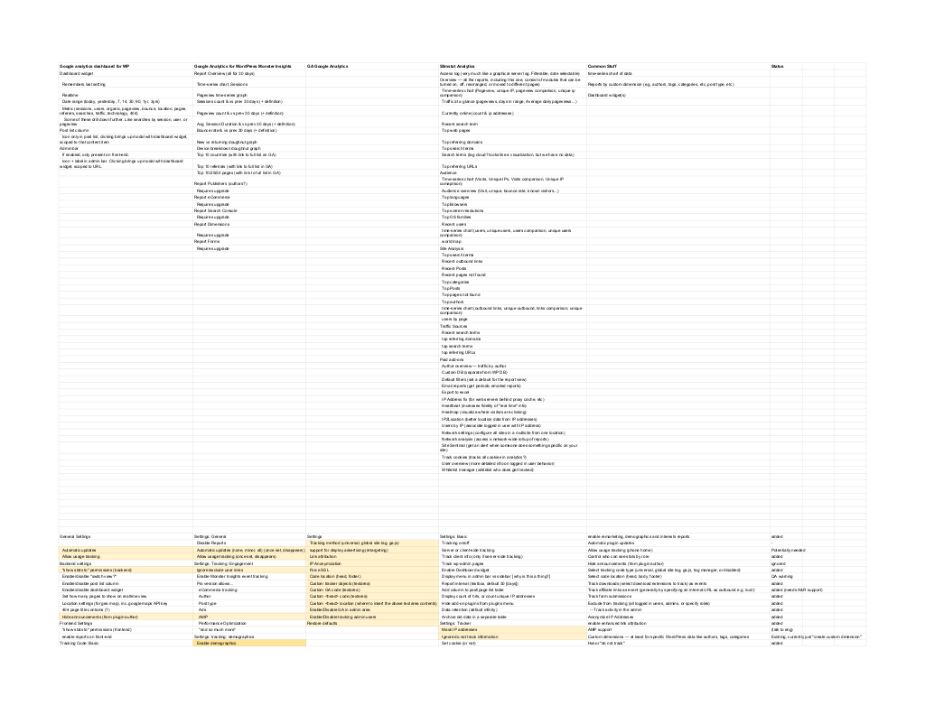
After installing similar plugins and reviewing, a list of common features and settings was compiled. 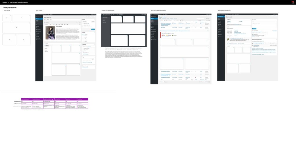
One of the key questions to determine in design was where to place data on various screens. We didn’t yet know exactly what the data was going to be (the product was still evolving), but we needed to create a system for where to display it. This is early exploration.

Stanford eCorner
How can we organize and 16 years of guest lectures to inspire everyone to adopt an entrepreneurial mindset?
Through onsite workshops and interviews, I mapped out a strategy that would use bite-size video clips and blog posts as an entry to full-length lectures and podcast episodes. My team continues to work with the university’s entrepreneurship center, helping them bring in new forms of media and expand their services. We continue to conduct research, design, and iterate on features.
View design artifacts
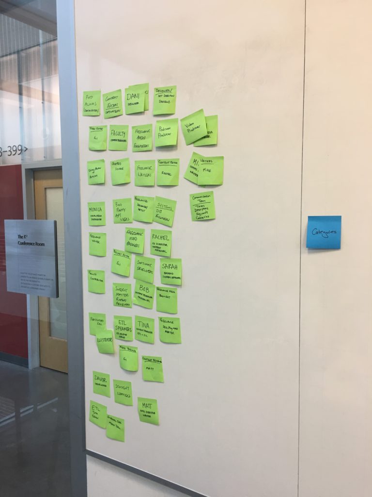
Diagramming people involved in content creation during an onsite workshop 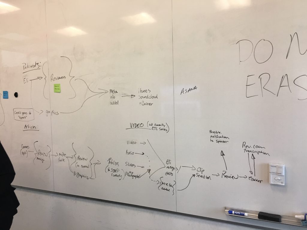
Mapping the editorial workflow for different content during an onsite workshop ![Slide: Early [navigation] Wireframes for Large Screen](https://intentionalux.com/wp-content/uploads/sites/2/2020/07/IA-Presentation-7.png)
Slide from an IA presentation showing how my proposed IA strategy might work in a desktop wireframe. 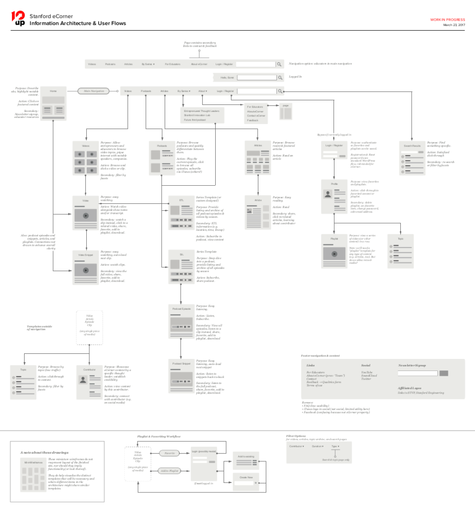
Proposed information architecture, templates, and key user actions 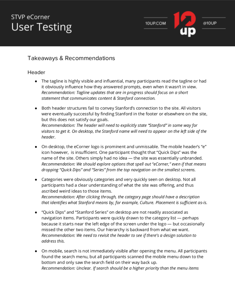
First page of a usability report produced as part of our iteration process. Findings included these high level themes, and quantitative usability scores.

Starbucks Newsroom
What is the quickest path to merging content from three existing websites into a single, modern newsroom?
To solve this issue, I conducted a content inventory on all three sites and constructed a combined architecture. Additionally, I created wireframes reusing components from the most modern of the three sites as much as possible. With a rapid migration completed successfully, Starbucks engaged us to conduct detailed user interviews and recommend platform iterations including integrations with non-newsroom Starbucks.com content.
View design artifacts
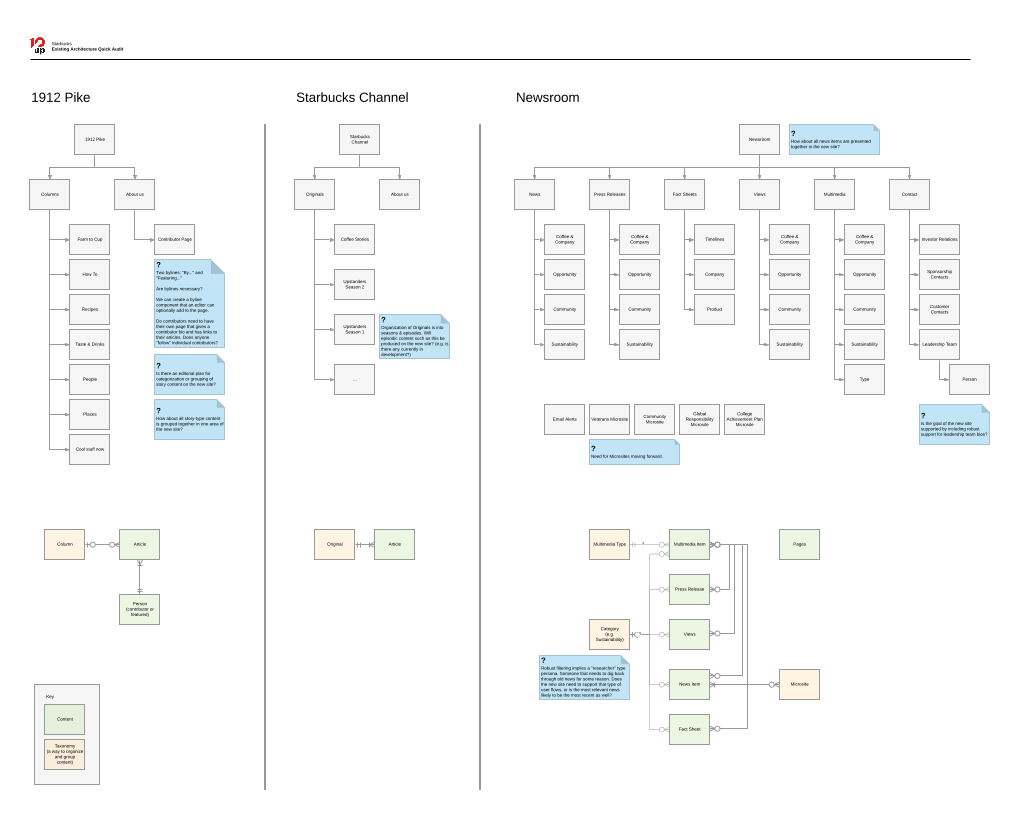
Current state IA mapping for the three properties that will be merged. 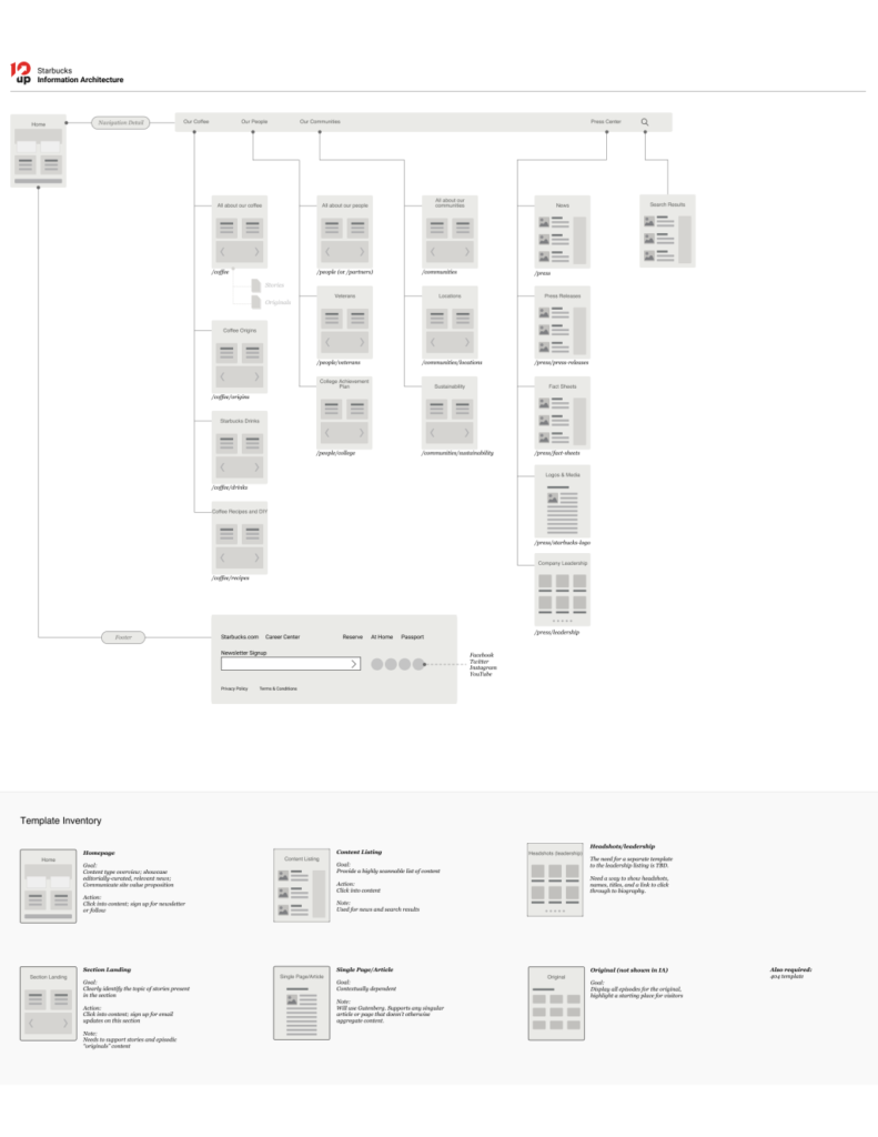
Proposed IA and template inventory diagram 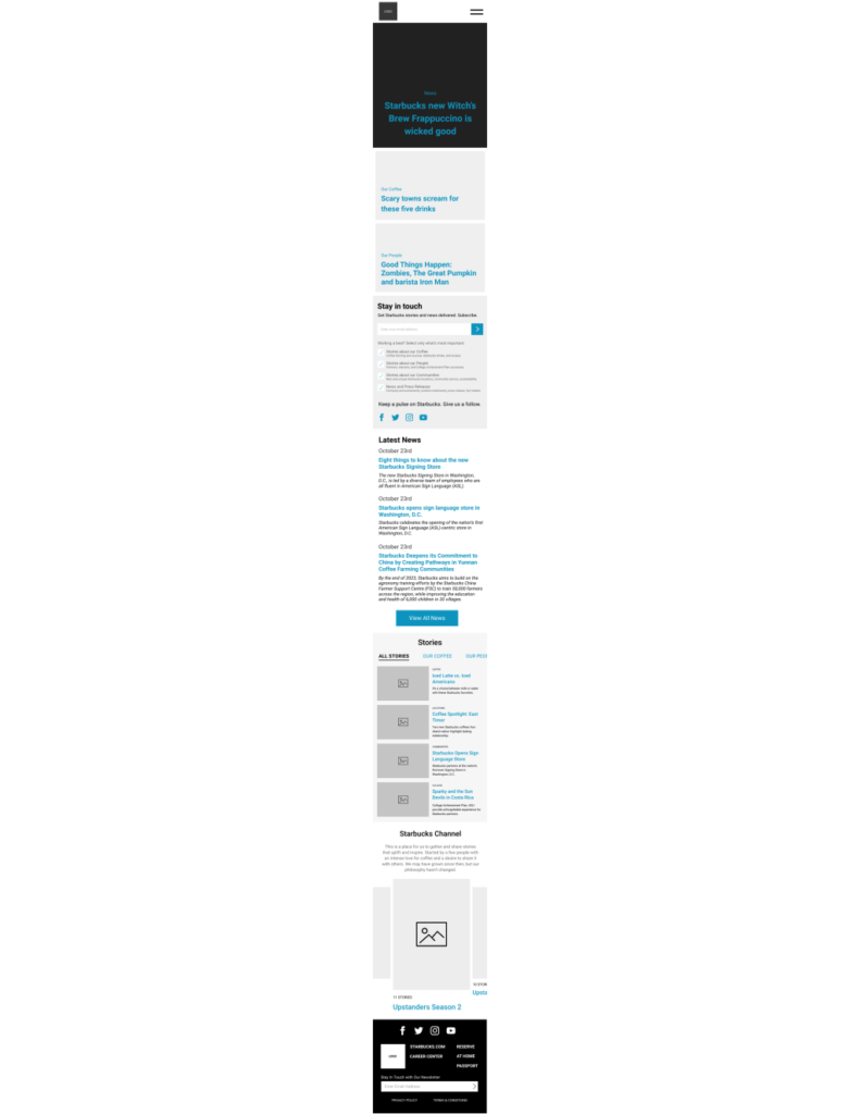
Wireframes for small screens. Blue is used to denote clickable elements. Real content from the existing site was used. 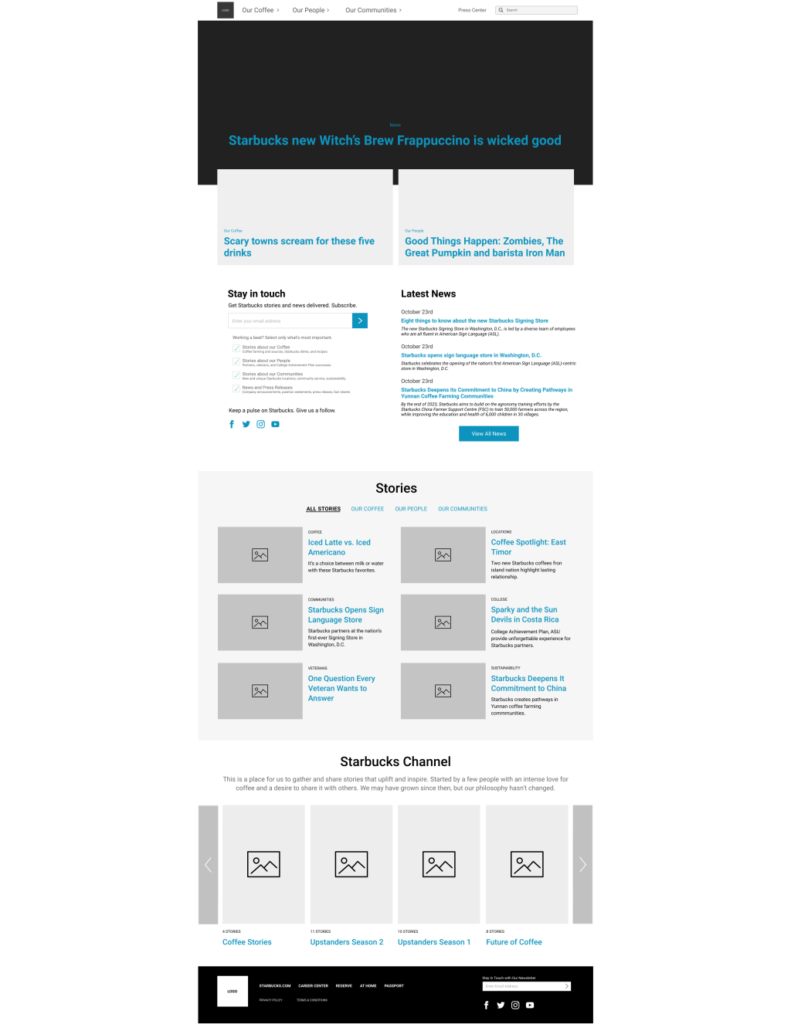
While small screens more easily show content hierarchy, many clients request large screen wireframes. 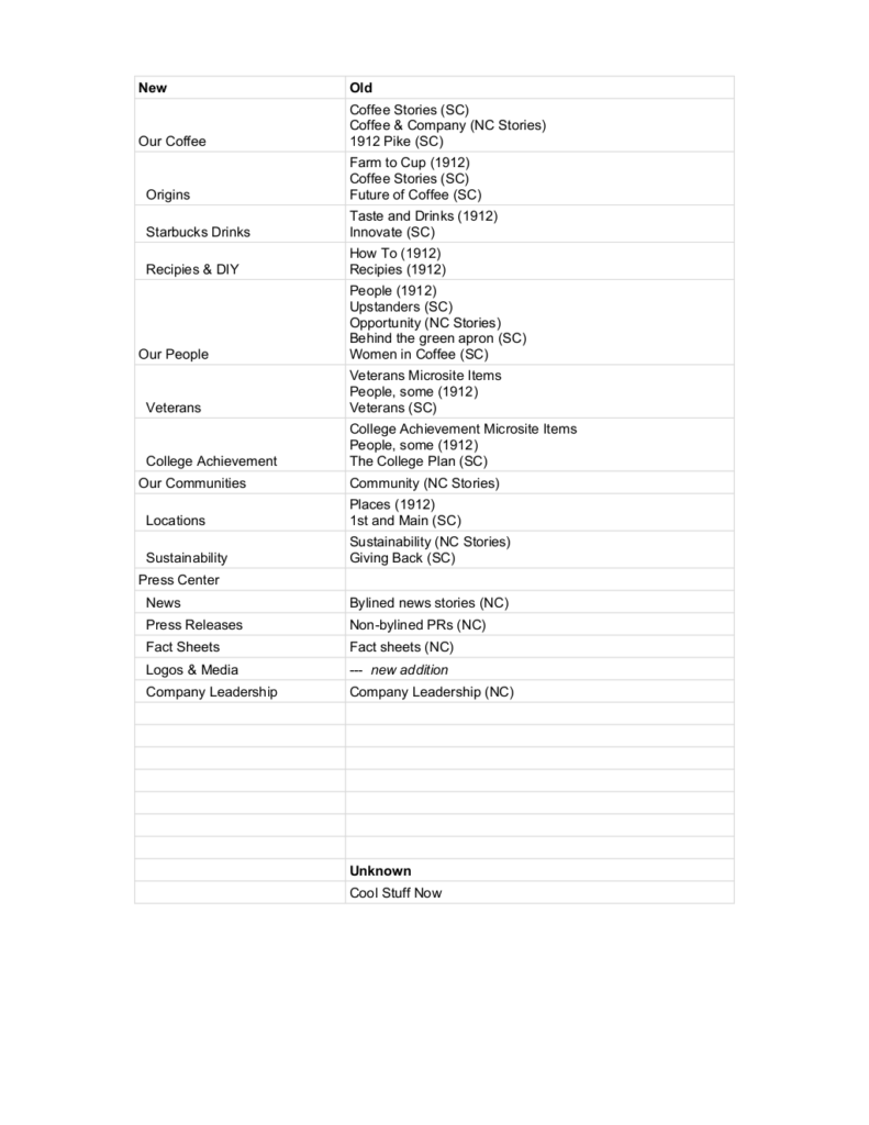
In any migration, mapping content requires coordination with engineering, editorial stakeholders, and usually lots of spreadsheets. This was a fairly straightforward migration spreadsheet used to confirm alignment with everyone involved.
JDRF
How can we help new volunteers and employees at local JDRF chapters understand how JDRF engages with someone who has type 1 diabetes: from diagnosis to donor?
I shaped this project to become a detailed journey map. To collect data, I conducted stakeholder interviews, performed statistical analysis of their donor database, scraped stories and videos from the web, planned and conducted participant interviews.
With data in-hand, I created a prototype journey map with digital sticky notes, which was edited with stakeholders for clarity and alignment with internal language.
Finally, I collaborated with a visual designer to produce a beautiful, printable poster intended for distribution to local JDRF chapters nationwide.
View design artifacts
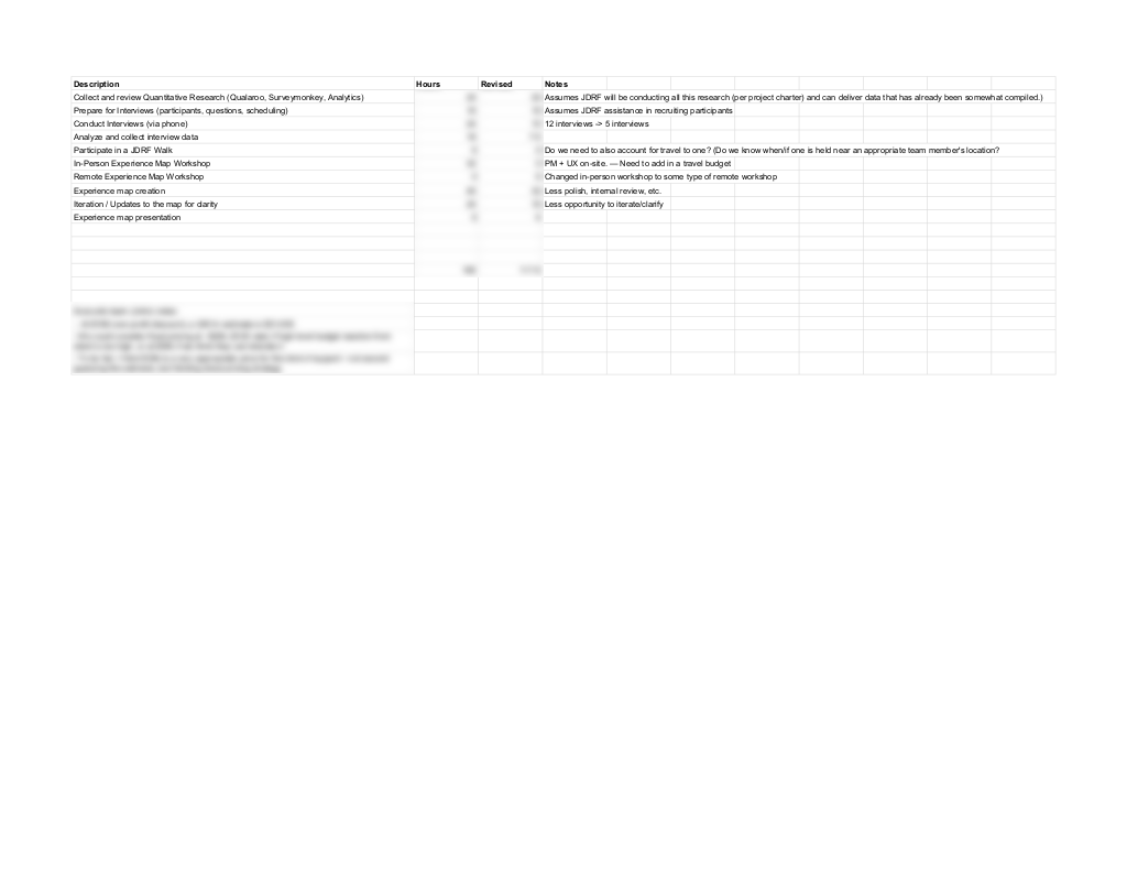
Determining approach and estimating the time (and therefore budget) is integral to my job as design manager. 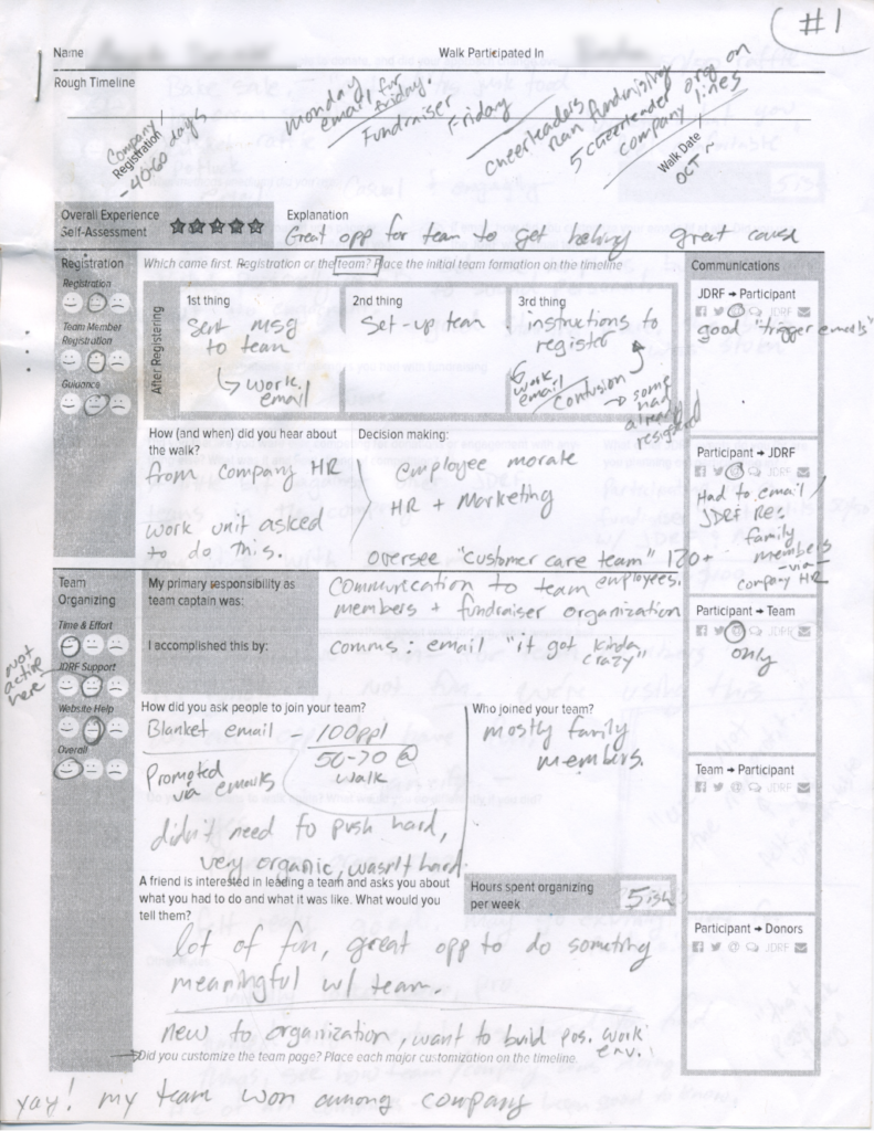
I prepared an interview note taking sheet to capture structured qualitative data during interviews. The interviews were also recorded and these handwritten notes were turned into typed documents 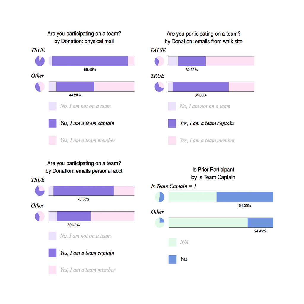
JDRFs participant database was analyzed for statistical correlations, here showing how being a team captain has a positive correlation to certain behavior. 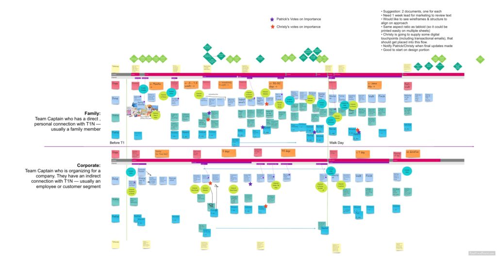
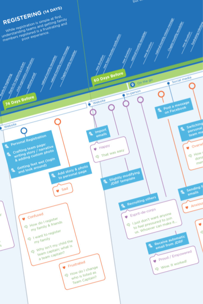
The first version of the journey map was done using a low-fidelity digital whiteboard. It was then explored and expanded upon through additional client workshops before becoming a high-fidelity comp 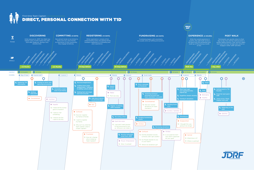
The final high fidelity poster was prepared to be printed and hung. I worked with designers on a number of design iterations to best visualize the data.
